Measuring relative strength and relative weakness is a common, simple but powerful concept for stocks chart analysis.
This is a principle of measuring relative performance between two (or more) symbols within a defined period of time. You can check this performance for the last year, half year or a shorter time frame.
My charts measure a three-month time frame. Since my trades are swing trades lasting between one day up to four weeks, I check my charts for performance during last two or three weeks of price movement.
Why is this technical trading tool so important for traders
When you find a “strong” ticker, you can see shares with money coming into company’s shares. The “big boys” are greedy for these shares and so are buying them and pushing the price up. So you can buy it too, and just wait as someone else does the work (pushing the price up). Nice, isn’t it? It’s like being on a boat navigating down the river.
When you find a good pick, wait for a pullback or breakout trade setup. So, how you can check if your pick is strong or not? I do it by comparing two price charts. Here is an example:
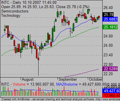
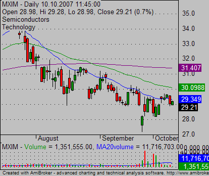
What we can see on these charts? I checked them and found these important points:
- the price of INTC is rising, there’s an uptrend
- the price of MXIM is falling, there’s a downtrend
- INTC acts much better then MXIM
- INTC is stronger ticker then MXIM
- INTC is a better candidate for a long trade, presents strength
- MXIM is a better candidate for a short trade, presents weakness
I found that the test for relative performance of two symbols can be done very easily by viewing the charts.
You can also compare a stock’s relative weakness or strength to a sector or industry. Check the stocks above with the chart of the Industry Index (Semiconductors).
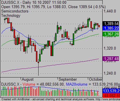
As you can see INTC is relatively stronger than the industry index (DJUSSC – Dow Jones SEMICONDUCTOR INDEX). And MXIM is definitely relatively weaker than this index. It presents weakness – good opportunity for short sell trade. If I think about a long trade with some semiconductor stock, then I would prefer INTC to MXIM.
And finally, it’s also good to compare relative weakness and strength between major US market indexes.
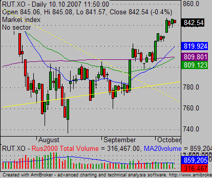
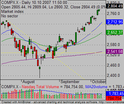
Both indexes are in an uptrend, but the NASDAQ Composite index is much higher than important moving averages like the Russell 2000 Index. This indicates that the NASDAQ Index is much stronger than the Small Cap Russell 2000 index.
Simple tip to improve your analysis
Moving averages can help us to visualize relative strength or weakness. If you see that one stock is above key moving averages (I use 20-day and 50-day averages) and another is under them, then the first pick is stronger than second one. You can see it also on the examples above.
Find more on related pages
- Use these two ways for stock sector analysis
- Inspire by this ETF trading strategy
- Find more about chart analysis