Using stock market graphs is a core issue in swing trading based on technical analysis. These graphs are used for an analysis and preparation of a trade setups in swing stock market trading systems.
Any swing trading system is based on trades that can last several days or a few weeks. Therefore, most stock market graphs analysis is done within a daily time frame.
But focusing exclusively only to this one time frame is a big mistake and can lead to big losses in trading.
It’s very important to see a higher level of chart, i.e., a weekly price graph. The longer time-frame helps to spot major support and resistance levels. Good technical trader knows that major weekly support and resistance levels are much more important than support and resistance levels found only through a daily time-frame.
Stock exchange graph analysis example
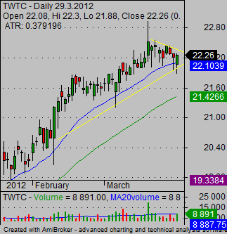
Here I would like to show some usage of price chart analysis that could be very helpful in any online market system. This daily price chart of TWTC shares shows a nice bull pennant chart pattern. This bullish stock chart pattern
could offer good opportunity for technical market trader that make swing trades.

When we look on TWTC long term price graphs then we could find that this opportunity is not as good as it appears on a daily graph.
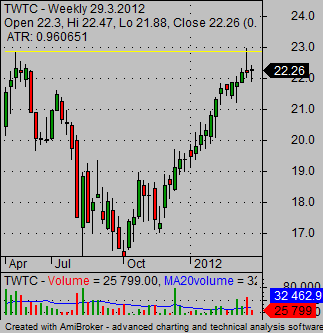
The weekly chart shows the first important resistance level just below the 23 USD. This is close to the possible breakout entry price for the bull flag chart pattern.

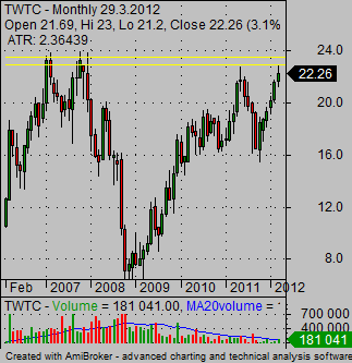
The look to the monthly graph time-frame provides another warning sign. It shows that the next level of resistance is below the 24 USD.

So we have discovered quite strong resistance area between the 23 and 24 USD that could hold any possible rise of the TWTC price. The analysis of long-term price graphs of TWTC leads to conclusion that a trade with this stock in swing trade systems is not a good option.
Fine tune also shorter time frame for analysis of graphs
It’s also good to monitor the chart with a shorter time-frame. For swing traders it’s typically an hourly or a four-hour (240 min.) chart. This type of chart helps to fine-tune your trade setup. It helps you to find a better place for entry and also the best place for an initial stop loss level.
It’s very important to see more than one time frame to make appropriate decisions about any situation. If you haven’t used more time frames, start to use them. It’s really your edge in the this business.
Find more on related pages
- How to read stock charts
- How to invest in stock market wisely
- Continue to check other stock market tips