The selection of the best stock sectors or the worst performing sectors in particular situation is a key for a profitable trading. Many private traders use this technique of top-down relative strength analysis to select the best and worst sectors. This information is crucial for further drilling down to find the top stock to buy and the short sale stock pick for bearish type of the trade.
This analysis can be done manually using visual method or you can incorporate some automatic analysis and research to your market analysis routine.
Visual evaluation for performance of stock market sectors
Here is a little chart technical analysis secret to make relative strength analysis simple. Strong stocks have a price in the top right corner of the chart and the weakest ones are priced in the bottom right part.
This option uses sector exchange traded funds to check stock sectors performance. The method is visual and it means that it is based on visual comparison of two or more charts with the same time-frame to decide which is stronger and which is weaker.
The comparison is done between the reference index for the group (like Nasdaq index) and individual sector exchange traded funds in this group. Similar comparison is used for the rest of the sectors in the S&P500 group.

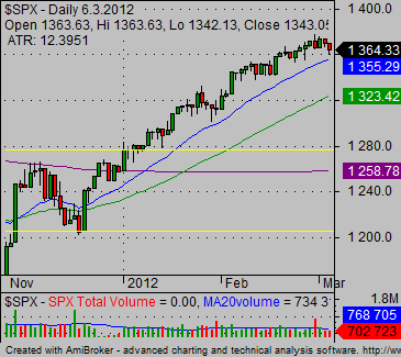
This is a chart of the S&P500 index. Now you can check the examples of weak and strong sector below.


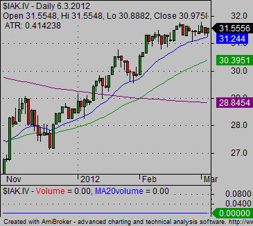
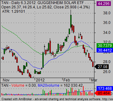
You can see on the charts above that sector ETF IAK is a strong part of the market and sector exchange traded fund with symbol TAN presents relative weakness to the general S&P500 index.
The situation tells us that the S&P500 index is in a bullish position and so we have to prefer to trade bullish trades with IAK over bearish trades with TAN.
It also defines that you should look for strong stocks in the insurance sector and for weak stocks in solar stocks sector.